This project began with two problems: making a game accessible for blind people and making a game that supports learning.
In the original thesis, the focus was on the accessibility of digital quiz games often used in education settings, like Kahoot! or Gimkit. However, for the exhibition, making a clone of these games but more accessible provided little scope for development, and so the alternative solution was to make a board game.
WIth board games, they often seem optimized to be as visually unaccessible as possible with dense visual details, information only provided visually, and sometimes needing to keep things secret from other players.
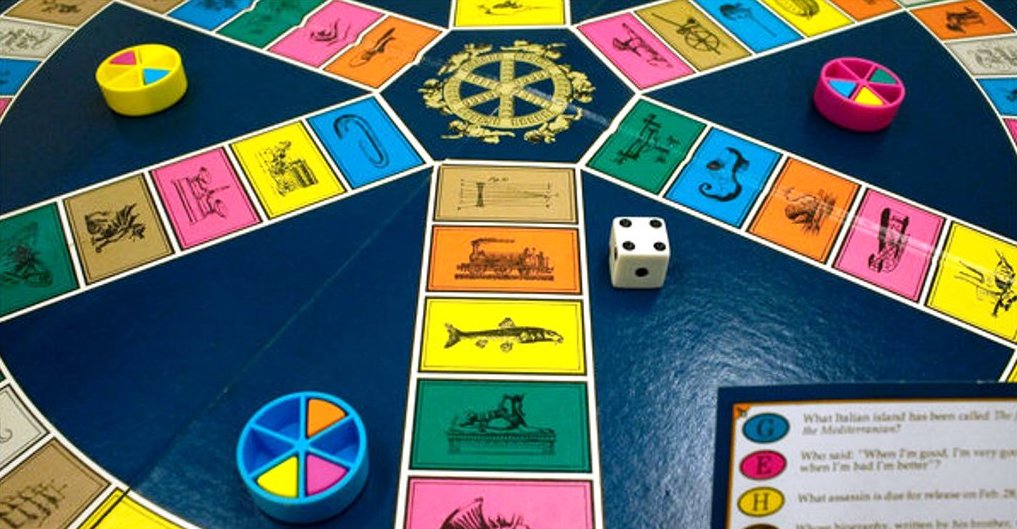
There’s also a gap in the types of educational board games on the market, with most games either being too surface level or too specific to support genuine learning on a variety of topics. Games like Trivial Pursuit involve remembering random, independent facts without any deeper connection whereas something like Wherlegig Games’ Pax Pamir, an in-depth game that puts players in 19th century Afghanistan, provides an immersive experience but a limited scope.
Both types of games have their places, but the point inbetween that requires a fuller understanding of subject matter while still covering a wider range of topics is lacking.
And so based on these issues, the project goals were defined: design a game that both blind and sighted players can play with autonomy and that encourages learning by challenging students while engaging them with play.
Back
Next
A first glance, my exhibition project may seem like a complete departure from my thesis, going from web-based quiz games to a mostly physical board game.
However, despite the different mediums, Quizzical History does stick to the cores of my thesis of visual accessibility and education working together. For a society that’s truly accessible, accessibility needs to be considered in every area, including education. And to achieve a full education, students need to learn not just traditional academics but also how to be in a diverse community, including diversity of ability and disability.
In the end, Quizzical History wasn’t a process of weaving together two separate directions, but instead trying to understand two halves of the same direction and, in one small way, make that direction more whole.
Back
Restart
With the goals for each challenge clear, initial ideation focused on accessibility. Considerations included legibility and readability, of course, but also going beyond visuals and using tactile and audio features for more sensory engagement and ways of delivering information.


Ideas
However, before these ideas could be fully developed, the game mechanics needed to be determined. At first, inspiration included games with broad, somewhat educational focuses like Cranium or Trivial Pursuit, but no clear idea solidified until it was framed with a simple question: “What games do you like?”
Ideas

The first game that came to mind was the party game Fishbowl, which pits two teams against each other to guess words or phrases from a shared bowl, starting with the rules of Taboo, then Password, and finally Charades, each round building on the last as the teams make connections between clues and become familiar with the lineup of words.
Ideas

Based on Fishbowl came the idea for Quizzical History, a history game that would require teamwork and bit of healthy competition to guess historical terms from a shared stack, with clues given in each round based on one of the 5 W’s: what, who, when, where, and finally why, requiring players to think about connecting history in context.
Ideas

With clear ideas for how both challenges could be solved, research was needed to validate or contradict them, especially for visual accessibility. Resources like 64 Oz Games, a company that creates visual accessibility kits for preexisting games, and their use of considered solutions confirmed their potential effectiveness.
Ideas

Another important resource was the lived experiences of blind people, whether shared anonymously on forums or in Youtube videos seen by millions. These sources shed light on a wide variety of considerations from board games that were enjoyable, textures that were most or least pleasant, or examples of effective tactility in packaging design.
Ideas
Having used the project goals to ideate solutions and having confirmed their potential effectiveness through research, it came time to put them to the test. Ideas that seemed perfect in theory could turn out as complete failures while the prototyping process could inspire possibilities that were previously unconsidered.
Ideas
Without any personal experience making board games, expert information was essential. Online resources by board game manufacturers, including articles about materials behind-the-scenes videos of factory processes, gave insight into how board games are typically produced.
Process
While the resources were very thorough, they also highlighted a problem: many of the initial ideas were specifically meant to go beyond current standards, but making the board game completely custom would offer little real world application. As a compromise, inspiration was taken from standard processes but applied in unique ways.
Process
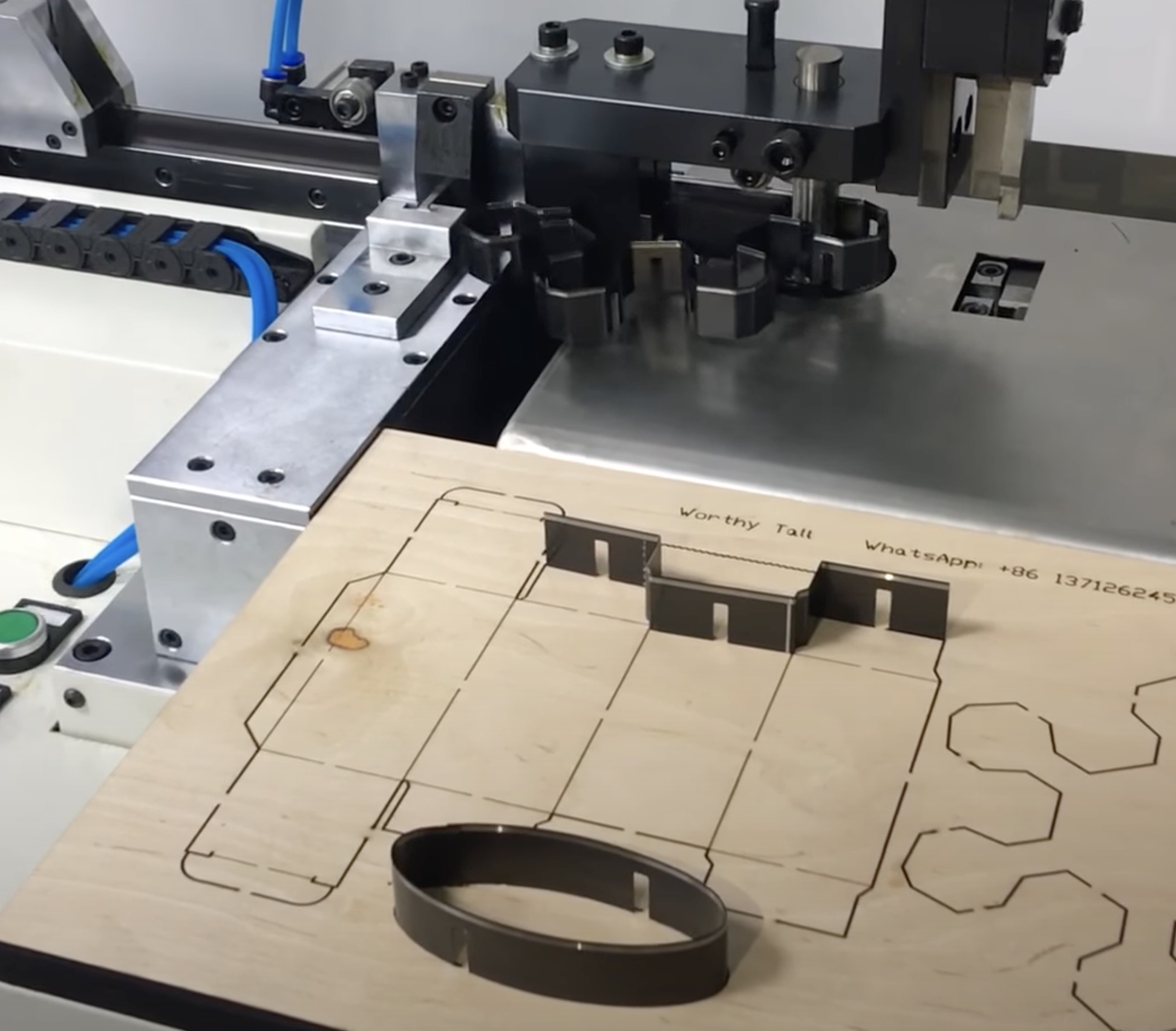
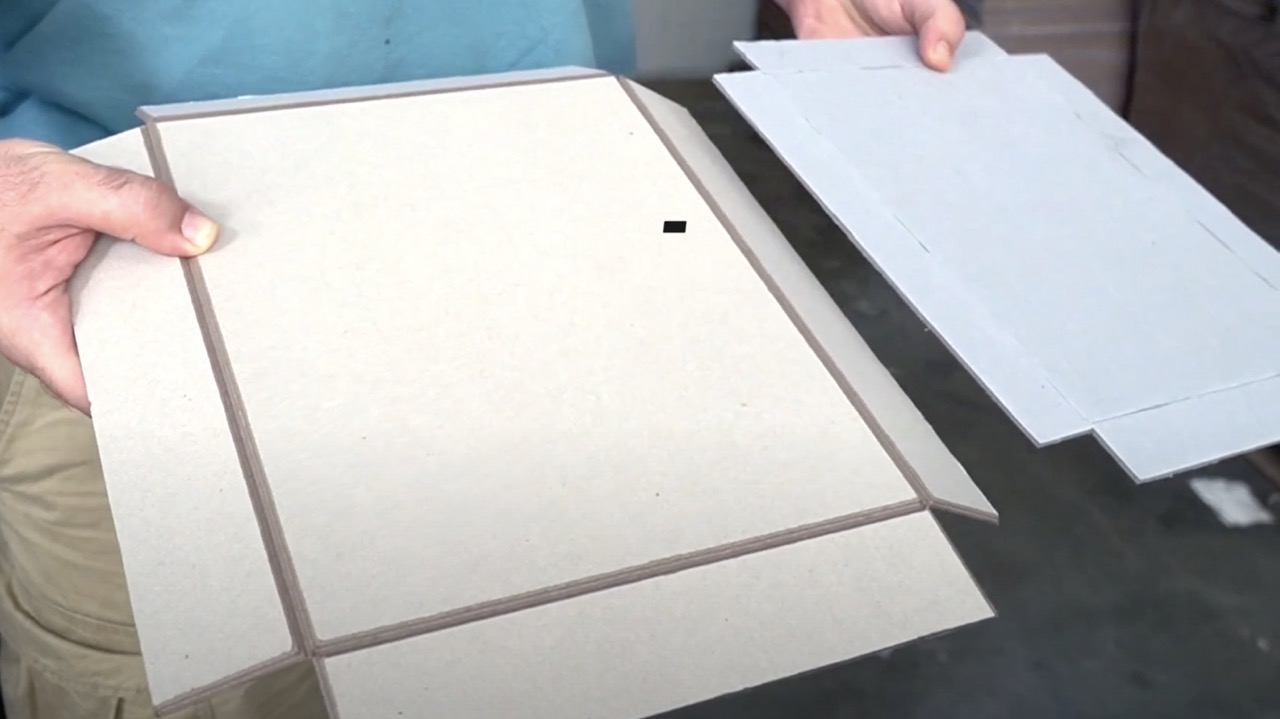
To prepare for the final product, each aspect of the project was prototyped. For example, the cards were first printed on poster paper to evaluate color, shape, and size. After edits to the initial designs, spare bristol paper was used to test adding braille and then printed on it to see how the thick paper would handle printing.

Process
Because the paper absorbed a lot of the ink and the planned large quantity, the bristol paper was abandoned in favor of printing at the university’s professional print center, which produced much better results. At the same time, the laser cutting process was tested to find a method that would cut the cards cleanly without scorching them.
Process
Another important decision was choosing the visual system of the game. The main consideration was the need for contrast for higher legibility and how that would affect overall color choices and their use in combination. After trying many color palettes and patterns, the final choice narrowed down to an option with both high and low contrast.

Process
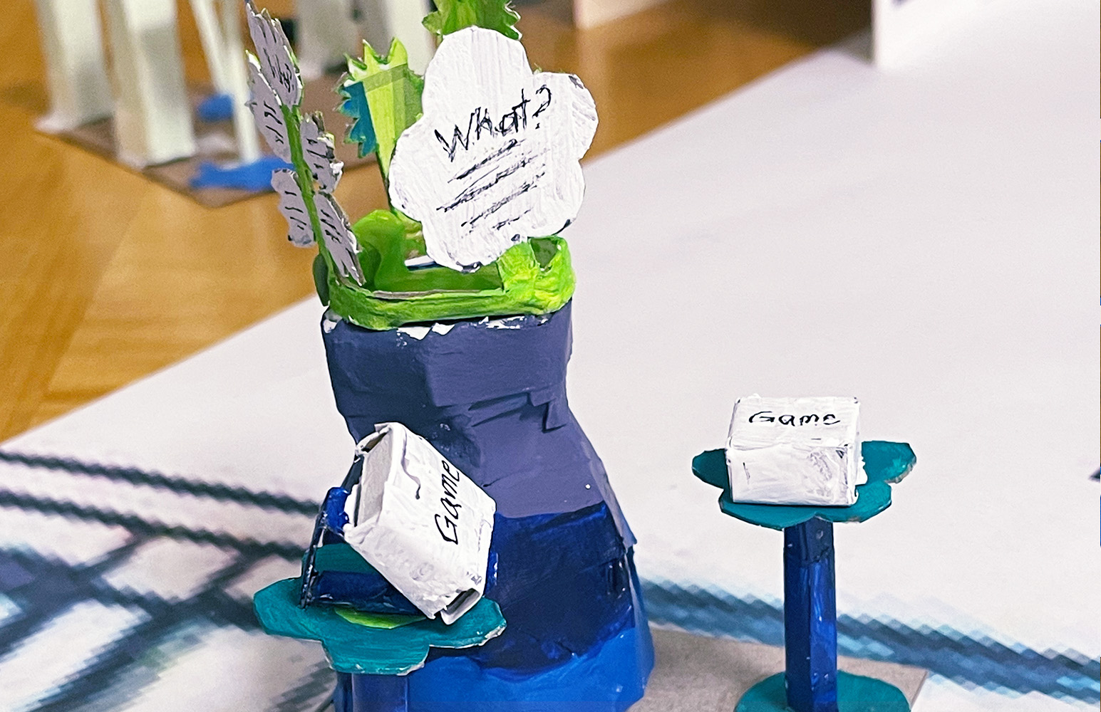
A final area of development was the exhibit itself. Based on the flower motif, initial ideas focused on a 2D flower or vase to display the game and additional information. However, these were visually underwhelming and didn’t invite interaction. By making the vase idea 3D and adding movement, the exhibit could be more engaging visually and interactively.
Process
While the process of making Quizzical History had plenty of setbacks, each small failure helped reveal how to avoid bigger failures down the road. And as deadlines drew closer, the need to prioritize made clear which ideas were most essential and which were unnecessary and defined what the final version of the exhibit would be.
Process
After getting feedback on design choices and testing prototypes, the ideas narrowed down until reaching their final forms. At the core of any board game are its rules. The base rules of Quizzical History borrow from Fishbowl, but in the interest of adaptability, there are also suggested variants outlined for different play styles and goals to fit different players' needs.

Solutions
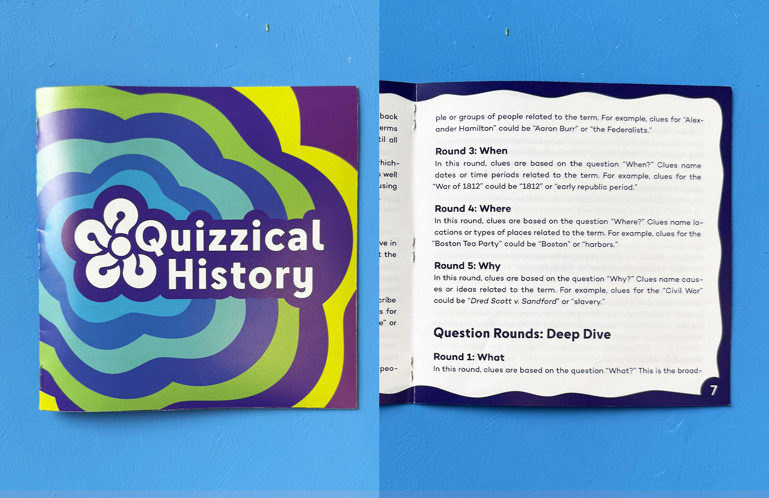
For the printed rule book, the main priority was legibility with high contrast colors readability with breathing room between lines. Making a braille version of the rules would not be practical, so the rulebook includes a QR code to a web page with the rules in a format that could be clearly navigated by a screenreader.
Solutions
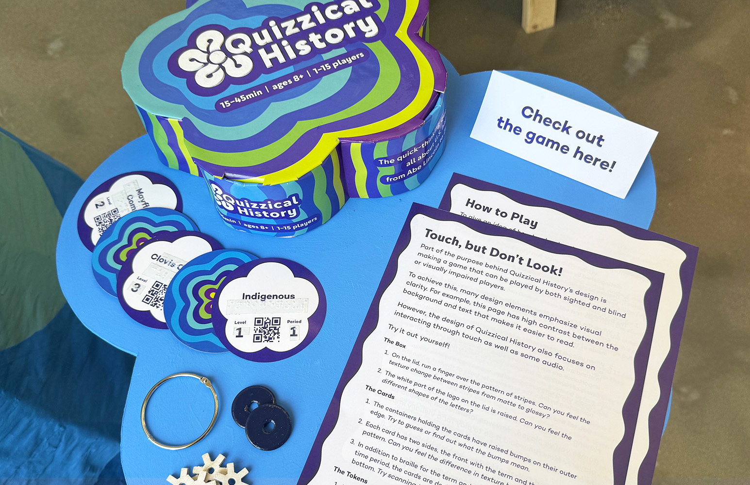
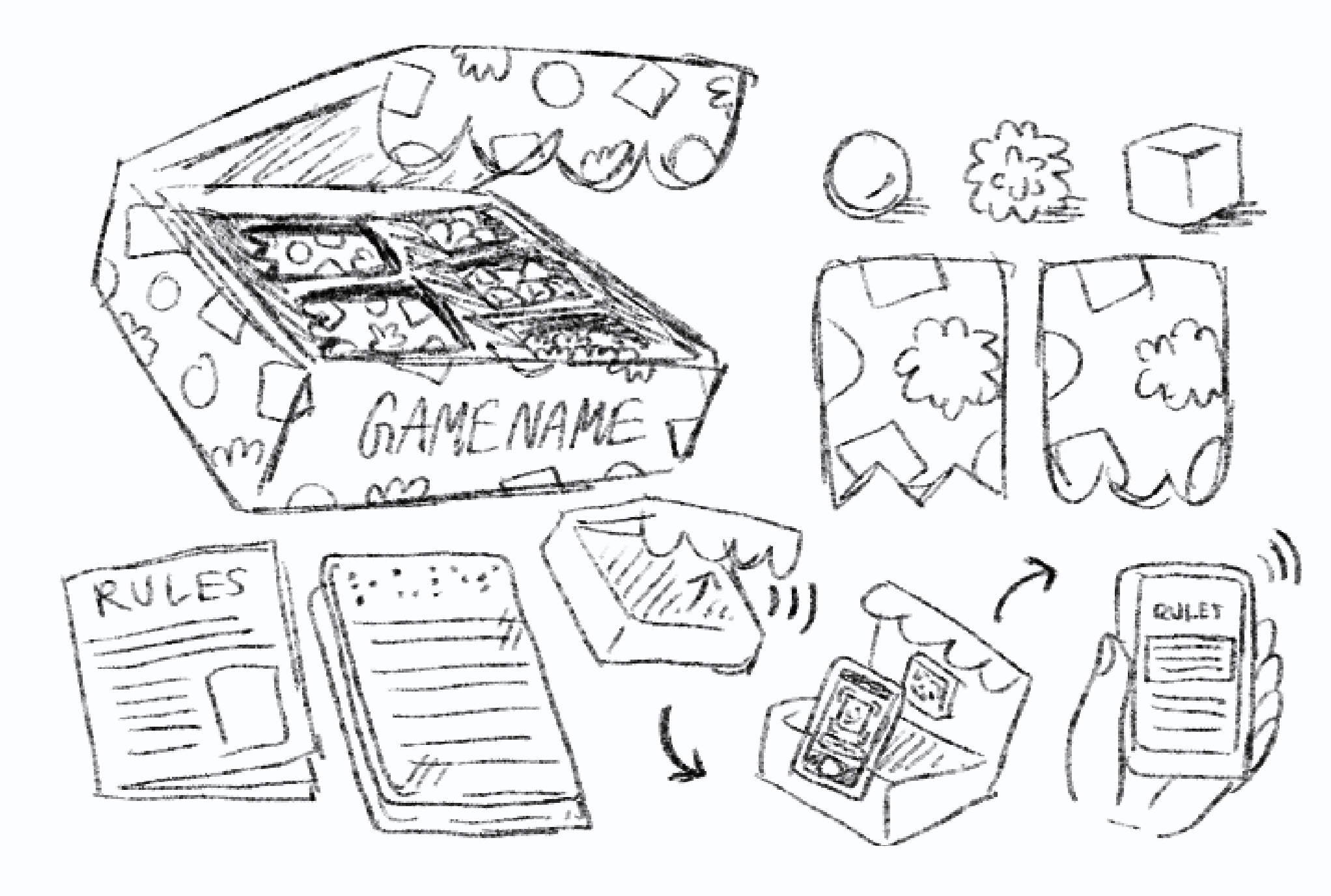
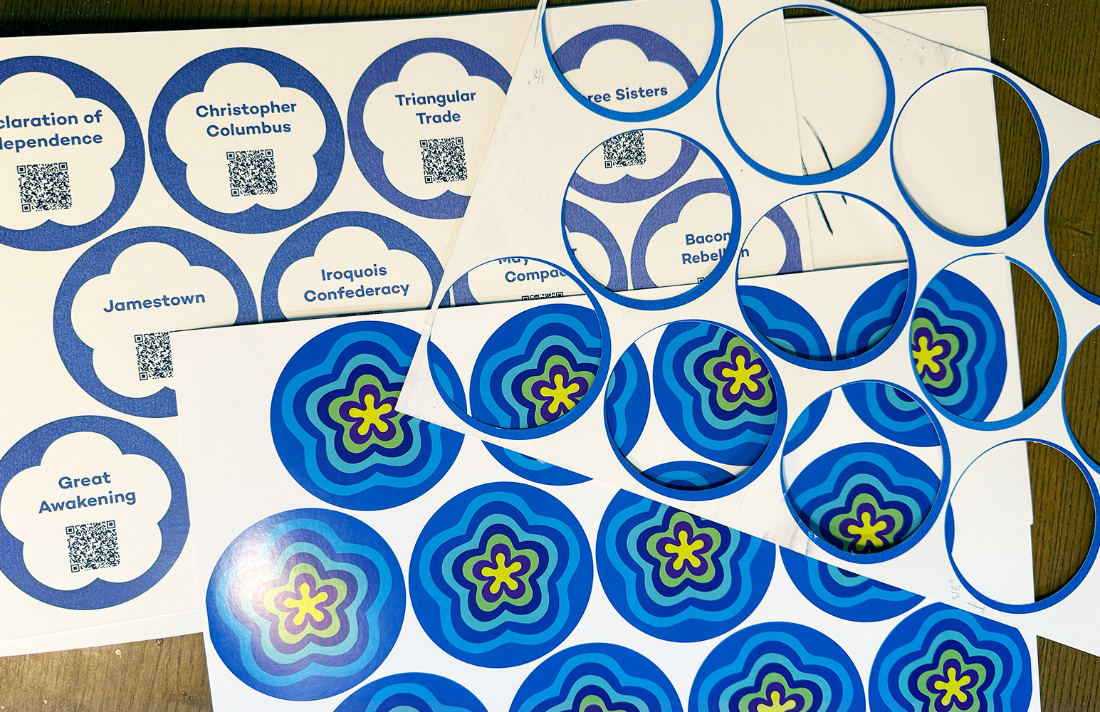
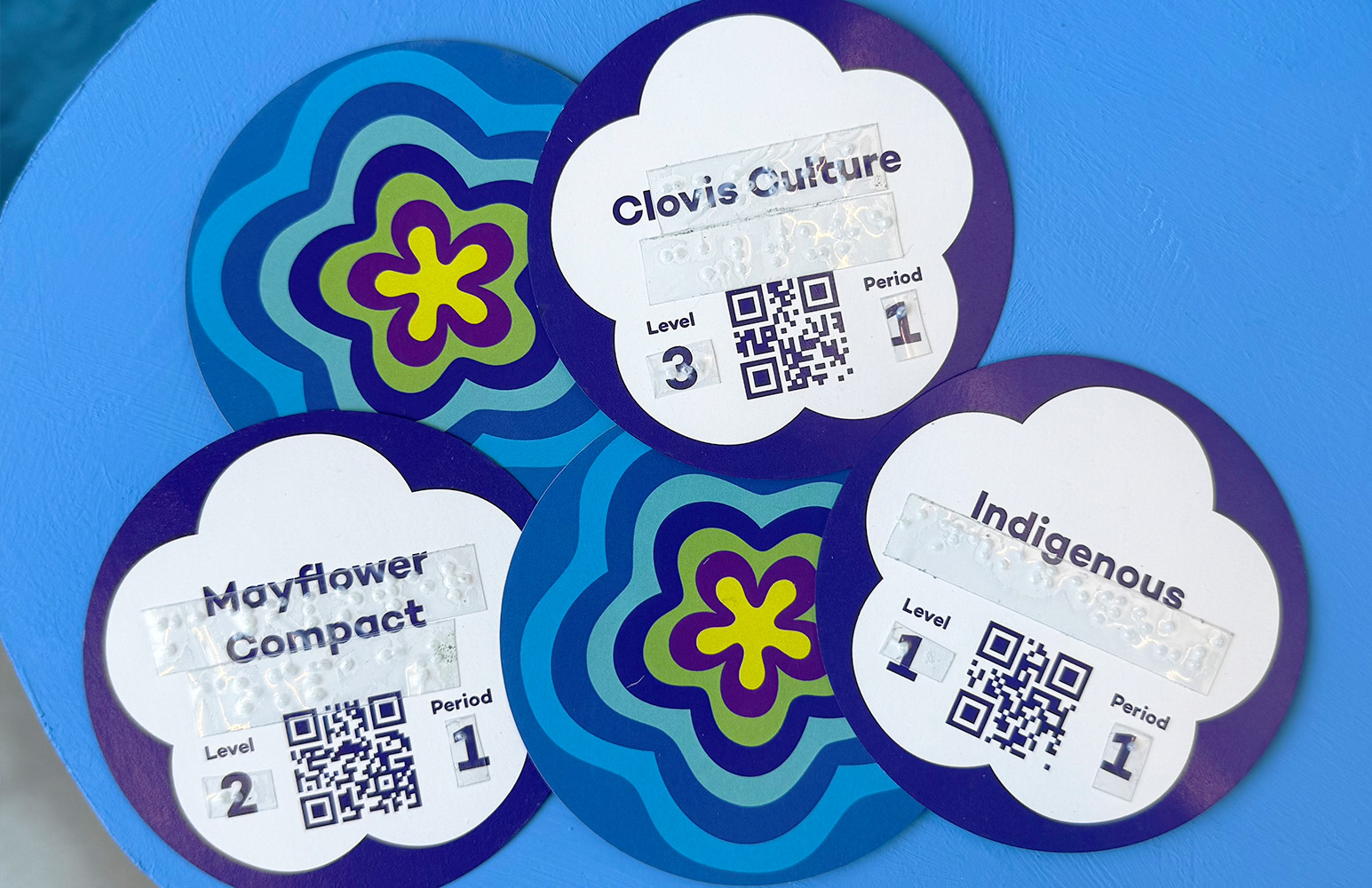
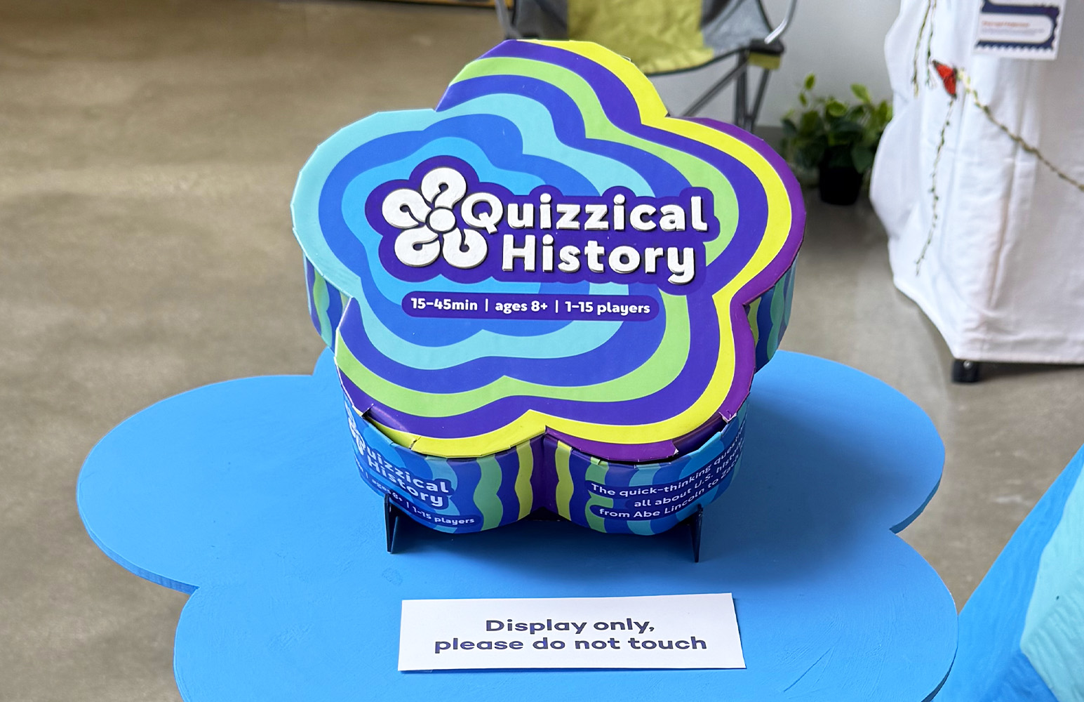
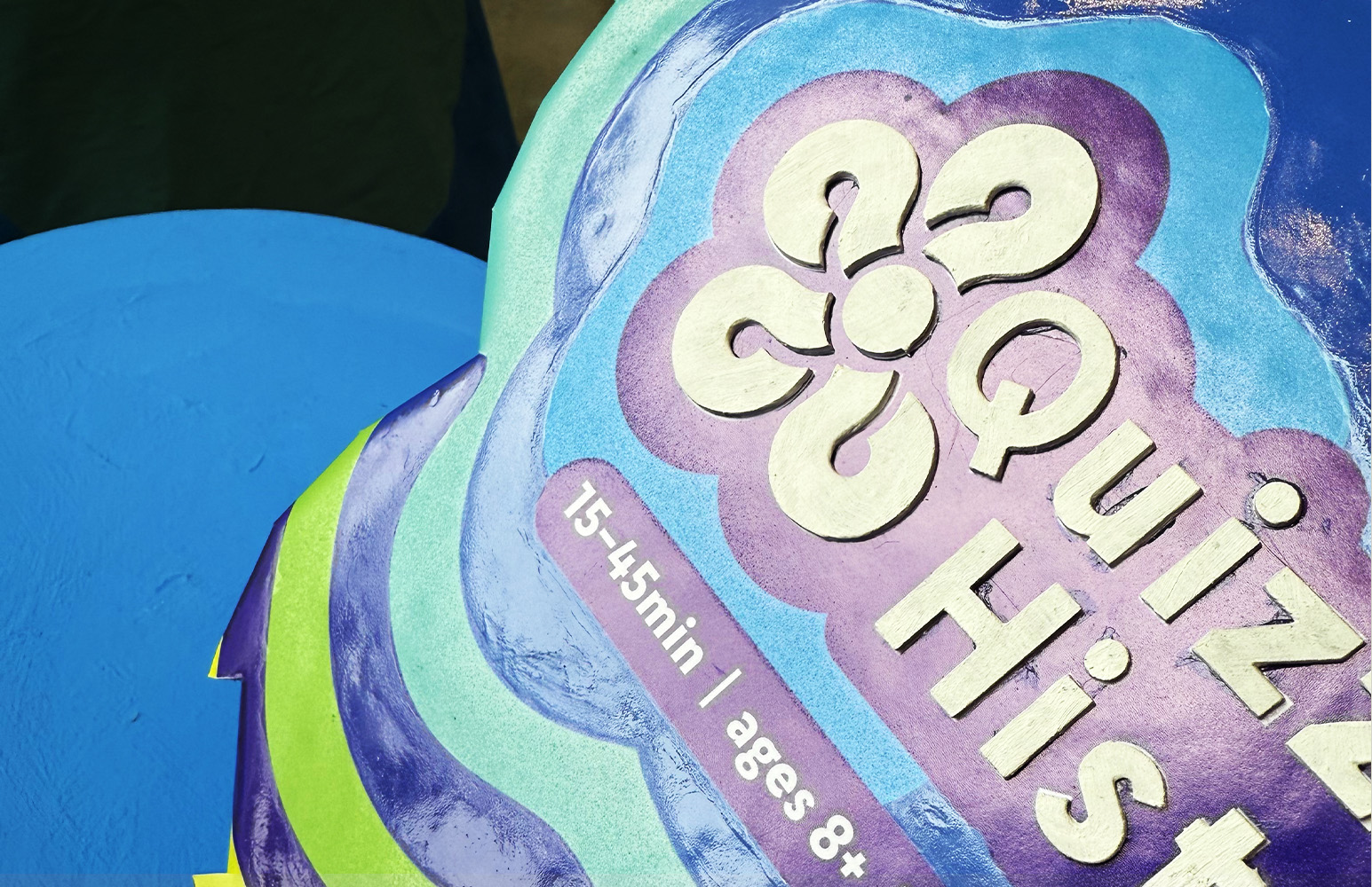
The next most essential part are the historical term cards. As in the rulebook, high contrast enhances legibility. In addition to braille, a QR code encodes the card’s text to be read by a screenreader since not all blind or visually impaired people read braille. For the time period and level of difficulty, tactile bumps make this information available to all players.
Solutions
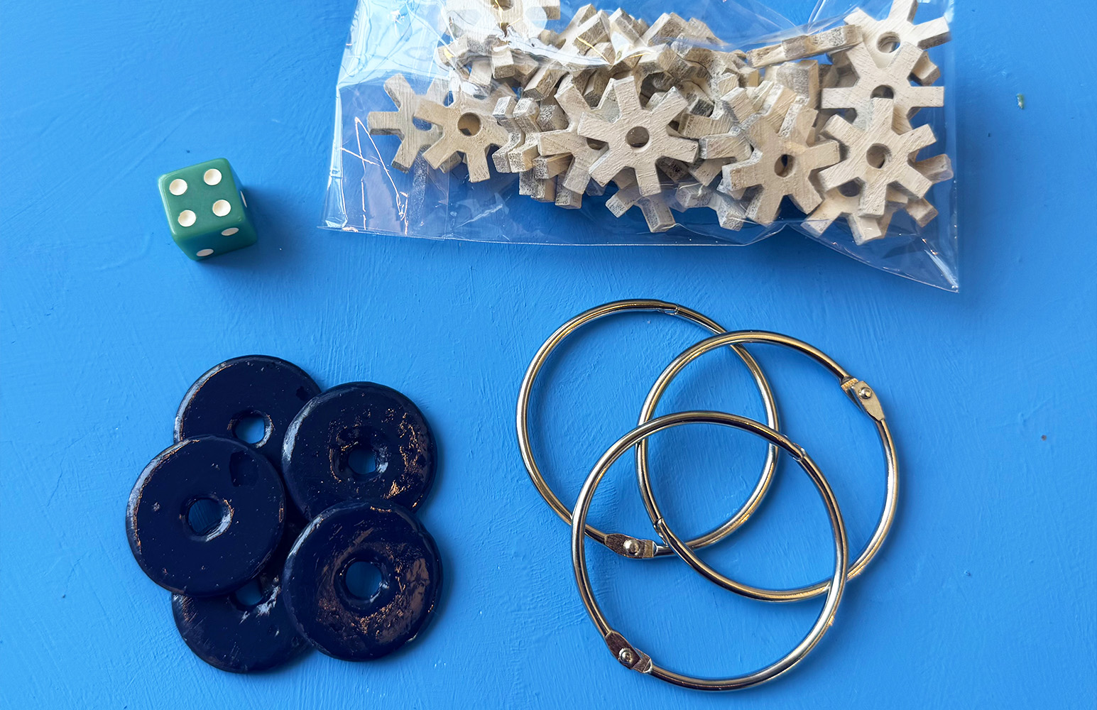
The score tokens presented opportunities for tactile engagement. Balancing practicality with purpose, the materials of wood and plastic adhered to board game industry standards while providing variety. The forms of each token are also tactile differentiators. To keep tokens organized, they can be placed on a ring, which also adds tactile interest.
Solutions
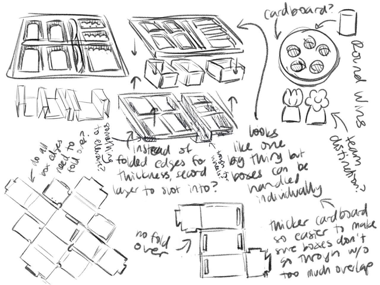
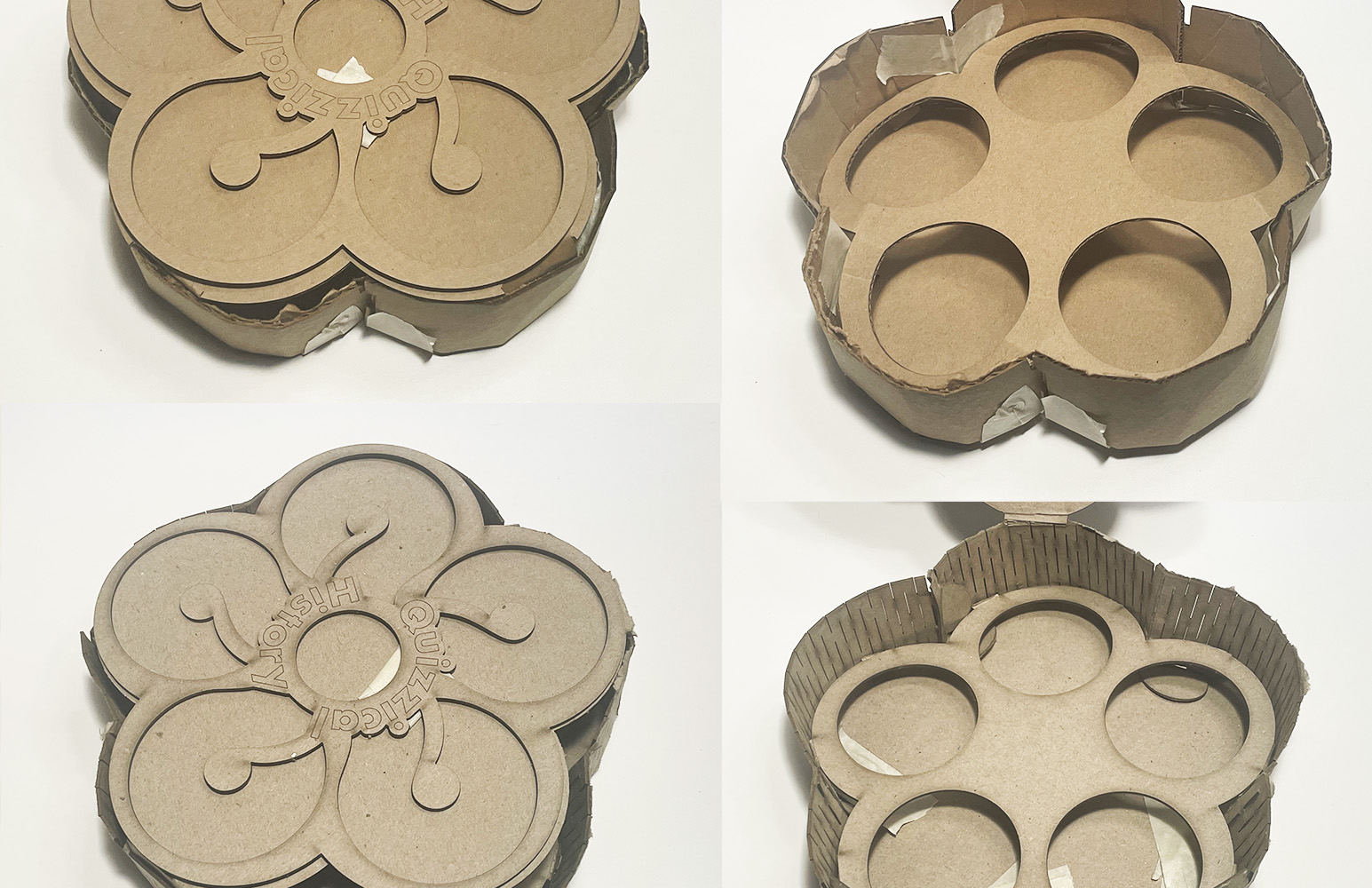
The box puts it all together. Like the tokens, practicality and purpose are balanced with inspiration from industry-standard boxes for the flower-shaped box. Standard boxes have side flaps that are folded up and glued. To make curved sides, a mold held dampened side flaps until they dried into a curve and could fold upward while holding their shape.
Solutions
Another industry inspiration came from the greeting card industry’s use of audio. Upon opening the box, a small audio device lets players know where to find a QR code for the online rules, minimizing the need for vision. The rules also tell players where to find and remove the device to account for different needs and preferences.

Solutions
While the box's colors and patterns have aesthetic appeal for players with sight, for players with very little or no sight alternative methods for aesthetic interest were needed. On the box lid, the pattern changes texture from matte to glossy with each stripe and the letters of the title are raised for another point of tactile interaction.
Solutions
For the visuals, contrast was an important aspect. Besides the high contrast text, there was also contrast in the decorative pattern to consider. High contrast throughout was jarring, but a completely smooth transition had no high-contrast visual interest for low-vision players. Transitioning from low to high contrast created a balanced solution.

Solutions
Finally, there’s the exhibit. Because the main focus is the game, the exhibit is designed to highlight it. The interactivity of the spinning vase display mirrors the game's tactile interactions. To present the game, one box is on display and another has written guides inviting visitors to explore, encouraging discovery through play just like in the game.

Solutions
In the final solutions, practical and conceptual considerations shaped the course of the visuals, like the idea of five questions inspiring the five-petal flowers or the need for contrast inspiring the pattern. It's very fitting for the medium of board games where games are defined by the function and story of their mechanics.